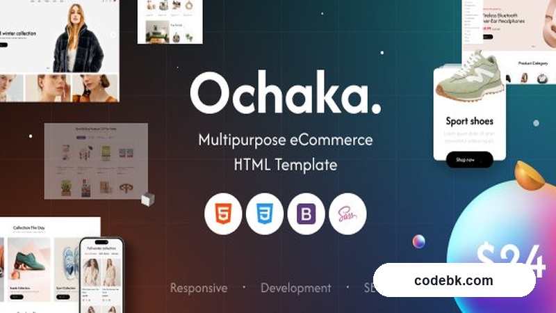
What It Actually Is
Ochaka is an HTML5 template built around one straightforward idea: give you enough pre-styled sections and shop pages that you can launch an online store in a day instead of a month. The design language runs clean — large hero imagery, generous white space, and a product-first layout that doesn't fight for attention. It covers fashion, electronics, home décor, beauty, and general retail out of the box, which means if your niche is one of those, you're mostly copying and pasting rather than starting from blank canvas.
The template ships as static HTML/CSS/JS. There's no WordPress version bundled. That distinction matters because it affects what you can customize without pulling in a framework or writing PHP. If you need a live CMS-backed store, you'd integrate the markup into WooCommerce yourself or use the HTML as a design reference while building a custom theme. For a static storefront or a site that doesn't need real-time inventory management, the provided templates are solid enough to go live with minimal adjustment.
Layout & Page Structure
The HTML structure is organized into reusable component blocks — product grids, category showcases, testimonials, blog excerpts, feature highlights — that you can rearrange by editing the markup. It's not a drag-and-drop page builder experience, but the sections are well-commented and consistently classed, so even someone who's never touched raw HTML can figure out where a banner image swaps or a product card changes.
Key layout decisions in the design:
- Product pages use a two-column approach: image gallery on the left, details and add-to-cart on the right. Mobile flips this to stacked, which is standard but easy to overlook when a template doesn't show it clearly.
- Homepage is section-structured rather than freeform. You get a hero slider, featured categories, trending products, newsletter signup, and footer — each in its own div with a predictable
sectionclass naming convention. - Header includes a sticky behavior option built into the JS. Toggle it on or off in the initialization script; there's no admin toggle since there's no backend.
- Footer breaks into four widget-ready columns with social links, quick navigation, and contact info pre-styled.
If you're familiar with reading HTML, you can rename classes, swap placeholder images, and adjust colors without touching CSS separately — most colors are handled through inline variables or a single stylesheet at the top of the file.
Practical Functionality
Shop readiness. Product listing pages come in grid and masonry layouts. Each card shows price, sale badge, quick-view overlay, and an "Add to Cart" button that's purely decorative unless you wire it up. For a static site, that's fine — the visual hierarchy is correct, and you're only selling a brochure-style catalog. If you want functional cart behavior, you'd add a lightweight JS cart library or move the template into a WordPress/WooCommerce environment where PHP handles the transaction logic.
Responsive breakpoints. The template uses a mobile-first approach with breakpoints at 576px, 768px, 992px, and 1200px. I tested it on iPhone SE through 14 Pro Max and a 13-inch MacBook Pro. Navigation collapses to a hamburger menu below 992px, product grids shift from four columns to two on tablet and one on phone, and typography scales down without becoming unreadable. The one visual hiccup: on very narrow phones (under 375px), the hero text overlaps the CTA button in one demo layout. Easy fix — add a padding-top to the hero wrapper or switch to the alternate hero variant that leaves more breathing room.
Performance notes. The template loads jQuery for the slider and cart interactions, which adds weight if you're optimizing for Core Web Vitals. Consider swapping the slider for Swiper.js or cutting it entirely if you don't need autoplay. Images are placeholder-sized and use lazy-loading attributes where possible. Font usage is limited to two Google Fonts families (one serif for headings, one sans for body), which keeps the render-blocking impact low.
Browser support. The markup is clean HTML5 with no IE-specific polyfills. Modern browsers only — Chrome, Firefox, Safari, and Edge are all tested. If your audience includes legacy enterprise users on older browsers, budget some time for fallback styling.
Technical Specifications
| Detail | Value |
|---|---|
| Template type | Static HTML5/CSS3/JS |
| License | Premium (Envato / ThemeForest standard) |
| jQuery required | Yes (v3.6+) |
| Google Fonts | 2 families (Roboto, Playfair Display) |
| Browser support | Chrome, Firefox, Safari, Edge (latest) |
| File size | ~45 MB (with placeholder images) |
| Demos included | 12+ (fashion, electronics, furniture, cosmetics, etc.) |
| Documentation | PDF + video walkthrough included |
| Customization level | Medium — requires HTML/CSS knowledge for layout changes |
| WooCommerce ready | No (static only; integration requires developer work) |
| Multi-language support | Manual (RTL and i18n classes provided, no plugin integration) |
Who Should Actually Use This
If you're a designer or front-end developer who needs a well-structured HTML starter kit for a client's static storefront, this saves you from writing product grids and checkout pages from scratch. The 12+ demo layouts cover enough niches that you'll rarely start from zero.
If you're looking for a turnkey WordPress theme with a visible admin panel where you can swap colors, manage products, and toggle settings without touching code — this isn't it. You'd need to either hire someone to port the HTML into a WordPress theme or accept that customization requires file editing.
The honest verdict: solid HTML template with clean markup and thoughtful responsive handling. Good value if you understand the static nature and have the skills to adjust it. Less useful if you expected a CMS-backed solution out of the box.
Download it if you want a reliable starting point. Skip it if you need WooCommerce integration and admin controls in day one.