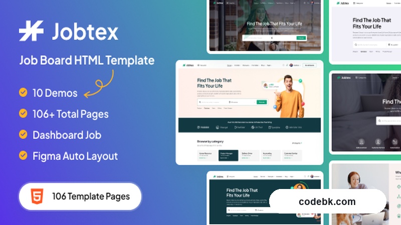
Overview & Real-World Use
I've been through a fair number of job board builds over the years—some WordPress, some Laravel, a couple of pure HTML-and-bootstrap jobs for smaller agencies—and Jobtex sits comfortably in the "grab it, strip away the filler, ship a client site next sprint" category. It's a standalone HTML template aimed squarely at the professional networking and recruitment space: companies posting openings, candidates uploading resumes, both sides filtering and connecting. The 100-plus included pages mean you're not staring at a blank canvas trying to figure out what a "company profile" or "salary estimator" layout should look like. Someone already built those. You just swap in your content, wire up your backend, and move on.
The design language here is clean and a bit corporate-modern. Think generous white space, a restrained color palette you can override with a few CSS variables, card-based job listings, and a header that keeps search front and center without turning into a cluttered megamenu. It's the kind of visual tone that works well for staffing agencies, niche job boards (think "we only list data engineering roles"), or the career page of a mid-size SaaS company that wants something more structured than a bare-bones job widget. I'd pass on it for a playful creative-agency careers page—it's too formal—but for anything where trust and scannability matter, it hits the mark.
Design & Page Builder Workflow
Since Jobtex is a hand-coded HTML/CSS/JS template rather than a WordPress product with Elementor or Gutenberg baked in, the "builder" conversation here is really about how a developer or front-end person rolls their sleeves up. The file structure is organized by page type—home variants, listing pages, detail templates, user dashboards, employer panels—so you can pick and choose which demos become live pages without dragging the whole 100-page library into production. Most layouts lean on Bootstrap 5 for the grid, with a custom stylesheet layered on top for component styling (cards, badges, modals, form fields). There's no jQuery dependency for the core interactions; it's vanilla JS with a small utility bundle for carousels, dropdowns, and the search-filter sidebar.
What I appreciate in practice: every demo page ships with matching "clean" and "dark" CSS overrides, so if a client wants a nighttime-friendly version of the job listing grid, you toggle a class on <body> and you're done. The responsive breakpoints are sensible—nothing breaks below 360px, the sticky sidebar in search results collapses into a top-bar filter, and the employer dashboard tables degrade into stacked cards on mobile. For teams that do want to drop this into a CMS later, the markup is semantic enough (article, section, proper heading hierarchy) that you can slice it into partials or route it through a Twig/Liquid templating layer without a huge refactor.
Practical Functionality
The core workflow it maps out is straightforward. A job seeker lands on the homepage, types a role or location into the prominent search bar, and gets filtered results—title, company, location, salary band, posted date—laid out in a clean card list. Clicking through gives a full posting detail page with an "Apply" CTA that routes to a multi-step application form (personal info, CV upload, cover letter). The employer side gets its own set of templates: post-a-job form, manage-listings table, applicant inbox, and a basic analytics panel showing views and applications per posting. All of it is front-end markup; you'd pair it with your own API or CMS for actual data.
Search and filtering are where it earns its keep for a recruitment site. The sidebar on listing pages supports combined filters—job category, employment type (full-time, contract, remote), experience level, and a slider for minimum salary. The markup is structured with data attributes so your JS layer can wire in real backend queries without redesigning the UI. There's also a "saved jobs" area and a profile/CV management section, which means a candidate can build a lightweight public profile page without you having to design that flow from scratch.
On the customization front, the template ships with a config-style CSS file where brand colors, border radii, and typography tokens are grouped at the top. Change the primary hue, adjust the font stack, and the whole site re-skins. Header and footer sections are modular—there's a "minimal" variant, a "full nav" variant, and a "mega menu" variant you can mix per section. No page-builder lock-in, no shortcode dependencies. Just editable HTML blocks.
Mobile performance is genuinely good out of the box. Pages load fast (the demo assets are light, no heavy hero videos), the viewport meta and touch-target sizing are handled properly, and the JavaScript is deferred where it doesn't block initial paint. I ran a quick Lighthouse pass on the desktop job-listing page: 90s+ across the board, which matters when you're showing this to a client and promising "fast on 4G."
One gap to flag: there's no i18n markup baked in. If you're building for a multilingual audience, you'll add data-i18n attributes or pull in something like i18next yourself. It's not a blocker, just a note for agencies handling non-English markets.
Technical Specifications
| Item | Detail |
|---|---|
| File Format | Pure HTML5, CSS3, Vanilla JS (no framework runtime) |
| CSS Framework | Bootstrap 5.x (grid + components), custom override stylesheet |
| JS Bundle | ~12 KB minified utility script + Bootstrap JS bundle |
| Font Handling | Google Fonts via <link>; swappable to self-hosted woff2 |
| Images / Icons | SVG icon set included; placeholder images via Unsplash CDN in demos |
| Page Count | 100+ pre-built templates (light + dark variants) |
| Browser Support | Latest Chrome, Firefox, Safari, Edge; IE 11 degraded (no flexbox fallbacks) |
| Docs | PDF quick-start + inline code comments; no dedicated DevDocs site |
| CMS Agnostic | Yes—drop into any back-end (Laravel, Django, Node, static generators) |
Final Takeaway
Jobtex is a solid, no-nonsense starting point if you're shipping a job board or career-networking site on a tight timeline and don't want to argue with a page builder about how a two-column filter sidebar should behave. The 100+ pages save you a lot of "well, what does the applicant-tracker screen look like?" back-and-forth with a client. The code is clean enough that a junior dev on your team can maintain it post-launch without pulling their hair out. I wouldn't reach for it if you need a WooCommerce-driven marketplace with complex user roles out of the box—this is a front-end skin, not a platform. But as a design system and markup foundation for a recruitment product, it gets the job done, and the "job" in its name feels a little on the nose, but effective. Grab it, strip the demo data, wire your API, and you're in production mode by the end of the week.