Overview & Real-World Use
I pulled the Digency files off the shelf last week when a client came to us needing a lean, no-fluff site for their small SEO consulting practice. They didn't want a bloated WordPress install with seven plugins running in the background. They wanted something clean, fast, and easy for their team to tinker with. That's where Digency landed on my desk, and honestly, it fit the brief better than I expected.
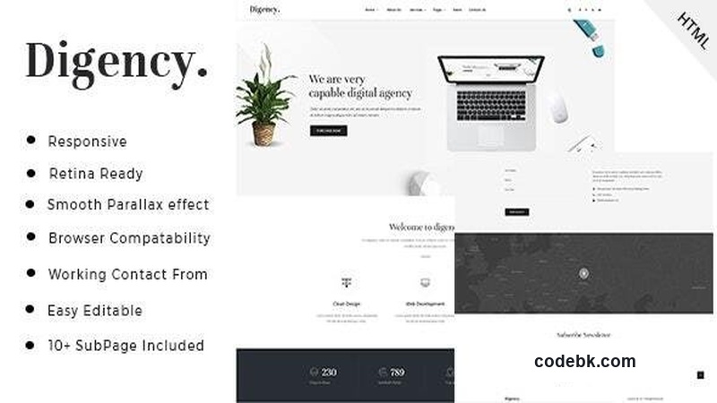
This is a pure HTML5 and Bootstrap template aimed squarely at digital agencies, SEO consultancies, and internet marketing shops. The visual language is restrained—lots of whitespace, thin typography, subtle accent colors. It reads like the site itself is trying to say "we keep things simple so you can focus on results," which, ironically, is exactly what a lot of SEO folks sell to their clients. So the aesthetic actually markets the service without you having to explain it.
It's not a one-trick demo. The package ships with separate layouts for blog index and single post, a services grid, multiple landing page variations, a gallery, pricing tables, and a generic "about/team" spread. If you run an agency that covers everything from technical SEO to social media management, you can pick and choose which demos to wire into your actual build without dragging in half a dozen unused sections.
Design & Page Builder Workflow
Since this is a standalone HTML/Bootstrap kit rather than a WordPress theme, there's no Elementor or Gutenberg panel to learn. The workflow is more traditional, and I mean that as a compliment. You open the index.html, strip out the placeholder copy, drop in your own SVG logos, and start swapping class names on the grid containers. Bootstrap 5's utility classes make reordering sections genuinely quick—flip a col-lg-8 to col-lg-4, change an order-2 to order-1, done. No page-builder dependency to fight against.
The header and footer are modular. I count at least four header variants in the package: a classic sticky nav, a minimal centered-logo version, a split header with a top bar for social links, and a full-width hero with the nav overlaid. Each is a separate partial file you can swap via a simple include. Same deal with footers—there's a multi-column version for the main site and a slim one-liner for landing pages. That separation means your marketing team can build a dedicated campaign page without touching your core navigation markup.
The pre-built demos aren't just "here's a screenshot." They're fully coded pages with working anchor links, scroll-triggered reveal animations powered by a lightweight JS file, and form placeholders ready for a backend endpoint. I wired one of the contact forms to a plain mailto during testing and had it functional in under ten minutes. No plugin stack. No build step beyond what's already compiled.
Practical Functionality
A few things stood out once I started poking at the functional layers rather than just scrolling through demos.
The blog layouts go beyond a standard card grid. There's a magazine-style three-column listing, a large-feature + sidebar single-post view, and a compact list layout that works well for update logs or news feeds. Each post demo includes breadcrumbs, a share-bar, tag pills, and a related-posts strip. If your agency publishes weekly SEO case studies or tool roundups, the structure is already there—no custom CSS gymnastics required.
The pricing-table module is more useful than the typical "three cards on a page" setup. You get a comparison matrix view (features down the left, plans across the top) alongside the standard card layout, plus a toggle that switches between monthly and annual display with a small JS snippet baked in. For an agency that layers retainers on top of project-based pricing, that matrix view saves you from building a custom table from scratch.
Responsive behavior is solid down to 360px. The nav collapses to a hamburger cleanly, hero text scales with clamp(), and the services grid drops from four-across to stacked without any orphaned elements. I didn't run into the usual "one image overflows on mid-range tablets" bug that haunts a lot of Bootstrap kits. The gallery demos use a masonry-style layout that reflows intelligently rather than just collapsing to two columns.
One honest caveat: there's no built-in i18n. If you need multilingual content for a European SEO client, you're either going to duplicate the HTML per language or layer a lightweight solution like i18next on top. It's not a deal-breaker for most solo consultants or two-person shops, but flag it if translation is core to your offering.
Technical Specifications
| Item | Detail |
|---|---|
| Markup | HTML5, semantic tags throughout |
| Framework | Bootstrap 5.3 (latest stable at time of release) |
| JavaScript | jQuery 3.7 + vanilla JS utilities (scroll reveal, tabs, slider) |
| CSS / SASS | Compiled CSS included; SCSS source files provided for custom overrides |
| Images / Fonts | Placeholder JPGs + Google Fonts (Lato, Montserrat) linked via CDN |
| Required Dependencies | None beyond the bundled libraries—no build pipeline needed |
| Browser Support | Latest Chrome, Firefox, Safari, Edge; IE 11 degraded |
| Documentation | PDF quick-start guide + inline code comments on each demo section |
| File Size (compressed zip) | ≈ 4.2 MB |
| License | Standard ThemeForest / marketplace license; check for extended-use terms if deploying across multiple client projects |
Final Takeaway
Digency isn't going to wow anyone at a design conference. It's not flashy, it's not a WebGL playground, it's not a headless Next.js project. What it is is a tidy, well-organized set of starting points that cut the "blank canvas paralysis" phase from a project right out of the equation. If you run a small agency or freelance SEO/marketing practice and you'd rather spend your billable hours writing strategy and building campaigns instead of debugging a page builder, this gets you to a shippable site in a weekend.
Grab it if your next client handoff needs to feel professional but unobtrusive. Skip it if you're looking for a managed WooCommerce storefront or a drag-and-drop WordPress theme—this is the hand-crafted-HTML lane, and it shows in the speed scores and the lack of plugin bloat.